Columbia Pictures
American institution- the Statue of Liberty is the main image, which would have an advantage of global recognition. The fact that it shows the statue as holding a light, which is shining brightly suggests that it is leading the way, as institutions go. The image is located in the clouds, suggesting that it is above all other institutions. The graphology of the font shows it in blocks, suggesting that its tough and robust- therefore it is there to stay at the top. The colour of the font is gold, which connotes a sense of prestige and wealth.
Paramount
Again, the clouds suggest that it is above all other institutions. The use of the mountain as the main image suggests that it is almighty and hard to overcome and beat. The lexical choice of 'Paramount' connotes a massive mountain, which reinforces the previous point. The text is quite soft and subtle in the writing style of a signature which suggests that it is quality and is more personal as the audience feel as if the creator has signed it especially for them. Whilst the font is quite soft, which could show weakness amongst the bold and brutish fonts of the other institutions, it is reinforced by the graphological feature of stars, showing quality (star rating for restaurants and hotels)
20th Century Fox
Big block font shows that it is strong, robust and resilient compared to all other institutions. The use of a low angled shot, looking up at the institution name shows it's dominance over other institutions. The use of spotlights suggest that it is at an important ceremony, with the logo as the main act. The colour gold, connotes a sense of wealth, but also as being the number one institution.
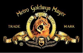
 MGM
The use of a lion as the main image shows that it is a predator, hunting the weak as it's at the top of the food chain. The face at the bottom has a mouth shaped like a love heart, revealing their love and passion for the industry. The circle around the lion suggests that they will keep on going and that their successes will continue coming. The gold film tape suggests that they make footage of perfect standard.
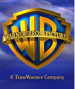
 Warner Bros.
Again, being located in the clouds, it suggests that this institution is above all others. The colour gold connotes a sense of wealth and being in the number one position. The logo is shaped like a shield, showing that it will defend it's number one position against any other institutions that possess a threat towards them. The continuous line of gold around the rim of the shield suggests that it will continue releasing products of such quality for a long time to come.
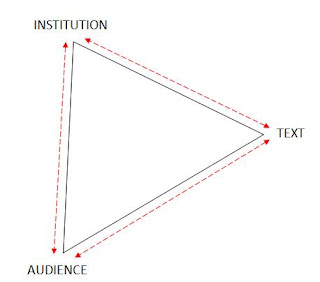
 The triangle of dependency show how the institution, text and audience are all linked in a state where all are reliant on eachother. It shows that;
- The institution must constantly adapt their texts in order to meet the demands of their audience, else the institution will get no profit from making any films.
- The institution must initiate some sort of consumer research and find out what their audience want from a new film, or to try and find a gap in the market for a possible new genre or sub-genre. Then create the texts so that when it is released, it will sell well.
- The audience needs the institution to produce new texts in order for there to be some sort of cinematic entertainment for people on a Saturday night- or for orange Wednesdays
- The audience needs the texts to be entertaining to fulfil their requirements (e.g. escapism)
- The texts need the institution in order to be produced and made into a film
- The texts need the audience to view/put money into the product for the institution to get a net gain.


No comments:
Post a Comment