Thursday, 1 October 2009

Where Can My products Be Located?

The finished version of my teaser trailer is located on the home page (page 3) on my website. The link to my website can be located under my blog post of; 'Website Address'. My final subsidiary task of the film poster advertising my main product, is displayed on my blog, under the title of; 'Film Poster Mock-ups'.

Wednesday, 30 September 2009

Q1) In What Way Does Your Product Use, Develop Or Challenge Forms And Conventions Of Real Media Products?

In order for my products to fulfil their ultimate purposes of attracting the audience into consuming it, I must use, develop and challenge the forms and conventions of real media products.

In my main task of creating a teaser trailer for an upcoming film of a genre of my choice I have, to some extent used a lot of ideas from existing products. The first is the time in which my trailer lasts for; it falls within the 50-90 second boundary that all teaser trailers, regardless of genre, usually last for. I have chosen to use this convention because if my trailer fell outside of these time boundaries, there is a chance that it will be too long to qualify for a teaser trailer or that it will simply be too short and contain too little detail about the narrative of the film. In context, the purpose of a teaser trailer is to tease the audience by creating a sense of enigma, therefore enticing them to consume the full products after completion so by keeping within the time boundaries of existing products, I have been able to give away neither too much, nor too little information regarding the narrative. In the section entitled ‘Codes And Conventions Of A Sports Drama’, I have listed the most common features that tend to appear in majority of films which fall into the same genre as my own. The setting, on a sports pitch, we have used is a common occurrence in real media products, so we decided to use this idea, especially as it matches the genre. The use of the protagonist participating in the sport he loves, on the pitch shows his passion for it, and keeps the key theme of 'sport' playing with the audiences' thoughts.

In order to make my trailer attract my desired audience, I must also develop some of the forms and conventions of real media products. I have done this in my main task of the teaser trailer, by exploring some slightly different themes to those in which existing texts use. In my trailer we chose to to focus on a key theme in detail, the use of drugs and it's effects, not for the protagonists' mind or body, but about how the people they care most about will react to their bad choice in life- whereas real media products, that I have researched 'Save The Last Dance' in which the characters of the narrative are taking drugs as a way of life, our protagonist is taking drugs to help enrich his life for very different reasons.

In order for my product to be a success however, I must also challenge the forms and conventions that are used in real media texts, this is so that the narrative of the trailer cannot be predicted due to the stereotypes that the audience will walk into the cinema with. A key setting of sports dramas is within a prison, this is featured in several films; 'Gridiron Gang', 'Mean Machine' and 'Escape To Victory'. I decided not to use this as a location at all, as I did not want to explore the harsh times associated with prison, this gave me the opportunity then to develop my narrative and explore some more relevant themes that are more likely to be closer to the audience, e.g. the theme of drugs and isolation from friends.

In my subsidiary task of creating a website in order to advertise the main product of the actual film, I must create a site that is going to complete this task effectively I must again, use develop and challenge the forms and conventions of real media products.

I chose to include a contact form on my website, which has been featured on other websites from films from a similar genre, for example; 'Rocky Balboa' and 'Coach Carter'. This gave my audience the chance to contact me, as the producer, with any comments or queries, this is another way to keep in continuous communication with the audience and gives them the chance to feedback through a different method- therefore this means that the amount of audience I am able to get feedback from is much wider than just the people I am in regular contact with at school. From my section entitled 'Website Analysis', I have identified that a trailer is a common feature on all websites, as an extra way of creating an element of audience participation- which in all is an effective way of keeping the audience attracted to the product. The use of featuring a trailer on the website also allows another way to market the film- using a new and different media technology.

In order to make my product unique and different to those that already exist I must also totally invent some elements to contain on my website. On some real media products that I have analysed there are some inspirational quotes from the film, whereas on some others there are none what so ever. I have chosen to develop the idea of featuring some quotes on my website, however, on the real products they are featured across the website and appear in a random sequence when you click from page to page ('Coach Carter'). However, due to technical issues with the website that I chose to use, I did not manage to figure out how to do this so instead I chose to put a small amount of quotes, 6, on the second page. I do believe, in a way, for this to be as good as the ways the real media products have used it, as when the quotes appear randomly you may see the same one a number of times, whereas all of my ones are there to read on one page.

One way in which I have made my product different unique, by challenging the conventions of real media products, is through the use of my background image. I chose to use an image of a road that seems to go on forever, instead of the conventional use of an image either from the film itself, or one set-up from the film- both still featuring the protagonist somewhere on the screen. My justification for doing this is simple; my website is there as a method to promote my film, and entice the audience to go out there and consume the main product, the film, so giving away too much information too early on does not seem like a logical idea to me, as if the actor playing my protagonist is not well known, this will give away the absolute minimal amount of information about him, and will build suspense for when the audience eventually gets to my casts page and sees them. I also chose to use this image because it links with the tagline of the film which is; 'Which Road Will You Take?', and as the image is of a straight road the audience will be led into believing that the protagonists' path is set out clear ahead of him, and in the early stages of the narrative, this is true- however the trailer which is featured on the website will reveal a different story for them.

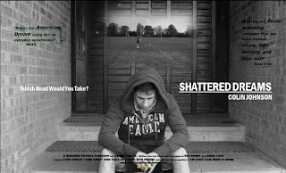
My film posters, as my second subsidiary task will also need to use, develop and challenge forms of real media products. I decided to replicate the obvious choice of having the protagonist featured on my actual full film poster, as this gives the audience an insight into the cast list. I also chose to use the conventional layout of showing the title of the film in bold letters, with the inclusion of the actor that plays the main protagonist shown above. This could help to promote the film, as if the actor was well known and their name featured on the cover of the film poster, then the audience would be more enticed to consume the product.

Finally, I have also challenge the forms and conventions of real media products (teaser poster), I have chosen to do this because by doing so, I am effectively challenging the stereotypes associated to a particular genre, which will have the effect of keeping the audience on their toes. Challenging too many forms and conventions however, can leave you're audience split as if you challenge them too much, your product will differ too much to that of existing ones and will require your audience to almost change their views on a particular genre, which would be hard to do considering you are challenging the ideas of many iconic films. I have challenged forms and conventions on my teaser poster, by simply totally changing the layout- I chose to not have the main image, one of my protagonist, but of a couple of playing jerseys instead. This has the effect of creating an enigma for the audience consuming the product as they would almost be second guessing who would be in it. This could also have the opposite effect however, whereby the audience are not attracted to it at all because they are not able to see who the main actor is (if they don't recognise their name). However, when employing the spiral effect, where I attained feedback after creating a particular idea- my audience liked this idea, so I decided to keep it this way. I decided in the first place to challenge this convention because of the context of a teaser poster- it is designed to be released a long time before the film (so actors may not have been confirmed, or script totally written, or production even started) and because the whole idea is not to give away too much information, both of which i believe my product does successfully.

For the main poster, I chose to use the conventions of having a mid-shot of the protagonist as the main image, and have again used conventions but not really revealing the genre of the film with this main image. This too, is used in other products such as the Gridiron Gang and Coach Carter posters which I analysed previously in the blog.

However, in both instances they have used a smaller, or blended another image into the background in order for the genre and specific sport to be realised. But because of technological hinderances, it was not possibly for me to do this with such effect, so instead and the way I challenged codes and conventions was through changing the colour of both images into black and white and blending them together in that way. The majority of similar products in the same genre have not changed the colour to black and white, however, I think it works effectively because of the mise-en-scene of the mian image- the indirect mode of address and generally closed body position of the featured character, suggests that times may be hard, and that the colour has been taken out of his life. Which is a definitive link to the narrative of the trailer.

Tuesday, 29 September 2009

Q2) How Effective Is The Combination Of Your Main Product And Subsidiary Tasks?

I believe that my overall product- the main task and the two subsidiary tasks- work very effectively, in unison with each other. There were some very obvious key elements that was a consistent feature throughout the whole range of products that I have produced. The title of the film was shown on each product, this is a way of advertising the film- as without there being featured anywhere people would not know what the poster, website or teaser trailer were for. Within the title, Mikey and myself decided to keep the font, it's colour and it's background colour. This is so that it is recognised as being the real, official product and not a scam from a fake company. These points link the three products together effectively, as once a person has seen how the title is set out once, next time they see it (through another way of marketing) they will remember it from the last time they saw it. Another element that runs consistently throughout the three products, is the use of the colour maroon. This colour has been used because it is the colour of the protagonists' rugby attire. It has been used in the teaser film poster (where the playing jerseys are shown hanging up) on the website (some of the key words in the quotes on the first page are in this colour) and in the main task (when the protagonist is show playing in his team jersey). I believe that this is an effective way to link the three tasks, because maroon is not a colour commonly used- either as the colour of the kit in existing sports dramas (e.g. Mean Machine they wear black, in Gridiron Gang they wear white), or just the colour in itself differs too much from the 6 main colours in the colour spectrum. On the other hand, where in existing products there are quotes on the trailer and film posters and websites, I have chosen to just use them on the website. This is definitely a way in which my products are not linked together by their powerful quotes that send tingles down the back of every member of the audiences' spine. All together I do believe that I have managed to effectively combine my three products so much so that my target audience would be attracted to them, and realise that they are all linked to the same production, and while I do believe that my tasks are not totally linked, but in each they help to create a sense of enigma in their own way.

Monday, 28 September 2009

Q3) What Have You Learned From Your Audience Feedback?

Throughout the production of my coursework, I have come to realise that receiving audience feedback is one of the most important points to consider when researching, planning and constructing a product. Linking this idea to the 'Triangle of Dependency'- without my audience, the text and the institution are nothing, I must therefore adapt my text to meet the demands of what the audience want, so I have had to use this idea wisely whilst completing each stage of the production. Before production had even taken place I decided that I needed to go out, find a potential target audience for my upcoming production and gain some knowledge about what they would like to see next on the big screen. This was the basis for my research and from here I was able to gradually develop my ideas, attaining regular audience feedback along the way, until I was ready to start planning for my final piece. Throughout this stage I decided to conduct only primary research where I was receiving my answers from various research types first hand. I decided to take a semi-structured approach to this, as I wanted to reach a hypothesis at the end of my research so that my product will be totally influenced by my audience, yet I do not wish to create an idea of bias, as this could influence the thoughts of my audience and they could be led to say something they don't really believe in, and when I crate the product to match this idea, they won't really like it because they have been influenced into saying something they don't mean. The idea of getting regular feedback along the way is called the spiral effect- this is when you create a certain amount of your product, then get audience feedback, then edit your product to match the demands and ideas of what you have most recently found out from the feedback. I found this to be the best way to make sure, at regular intervals, that my product was still matching the needs and requirements expected of me by my audience. At first I interpreted anything negative quite offensively as it appeared that my audience totally dismissed my product, however I learnt to use what they said to adapt my text to match their needs- as after all, it will be them that is consuming the product after completion, so in order for it to sell, they must like it. Before production had started, I got together a focus group of people that fell within my desired target audience, and pitched my initial film idea to them. From them I realised that I had a few minor weaknesses, and that if i were to amend them I would firstly increase my audience pool by, secondly introducing a few more key themes into the narrative that would help to attract a slightly wider audience pool towards my products. I'd say that I have learnt a lot from my audience research- the biggest point being that without my audience, the production is worth nothing. I am glad that I realised this early on in the planning stage as I have been able to keep continuous communication with my audience as every time something was created I required their opinion in order to make it better and more appealing to them- which is ultimately the key requirement when constructing something or such importance.

Sunday, 27 September 2009

Q4) How Did You Use New Media Technologies In The Construction And Research, Planning And Evaluation Stages?

New media technologies have been a massive influence in the ways in which the desired audience consume products in today’s world. Newspapers have been around for hundreds of years, but today it is just as easy- and definitely cheaper to consume this product over the Internet.

Almost everything done throughout the production of this piece of coursework I have used the relative new media technology of a computer.

In my planning stages for the subsidiary task of creating a film poster, I decided to find some existing film posters from the same genre that my trailer is going to be for. Once I had discovered one with an iconic image, I decided to replicate it. This gave me the opportunity to familiarise myself with some of the hardware and software I will be expected to use throughout the three tasks. For taking the picture, I used a simple Sony digital camera, once it was uploaded onto my computer I then edited the image using Paintshop Pro.

Also in the planning stages of my production I created a storyboard. Unless you class a pen and pencil under it, this initial stage was not created using any new media technologies- simply because we felt it would be easier to draw the images by hand. Once it was finished however, we used a scanner to upload it onto the computer so we could use it as evidence in our planning stages on our blog (will come back to later).

Whilst conducting my audience research, I discovered that my audience regularly view social networking pages; with the majority being Facebook now that the use of MySpace is becoming ‘out of fashion’. So I entered further research into how I could use a social networking page in order to help me advertise my product. So I have decided that I would use this social networking site as a method of making my product become more known across the World Wide Web.

In the construction stage of my piece I have use the new media technology of a handheld video camcorder. I assumed that the use of this would be easy; however it was much harder than we would have liked. The particular one we used did not upload to a computer easily, instead we had to put it on a DVD compact disk through the television and then editing could commence on a computer.

From the research stages, I have used the Internet in order to view existing products, from the analysis of trailers on YouTube to the still images searched and found on Google Images. The use of the Internet is one widely used by basically everyone that has access to it as it is easy to use, yet can sometimes bring in an idea of bias. This problem of bias has to be overcome, as explained in the section entitled ‘Audience Research’ from my blog.

This brings me onto another new media technology that I have used throughout the planning stages of this piece of coursework- blogging on eBlogger. Through this I have managed to document my every move in terms of everything I have done in order to make my main task and subsidiary tasks. Blogger’s simplistic layout makes it easy to use, organise and publish your work onto the Internet making it easy for a potential audience (or you, the examiners) to access and view. I chose to use this site because I had previously heard good feedback about the site, and upon just messing around with it, I realised for myself that this was in fact so.

Linking back to the use of the new media technology of the usage of a computer in order to construct my coursework piece, I have used this in several stages. As stated earlier, by researching, but then once this has been found via the Internet I have chosen to analyse and annotate this on the software package of Microsoft Word 2007. This is a simplistic package to use which is why I chose to use it. I also used this software in order to create my subsidiary task of the film poster, to advertise the film. I learned from my AS piece last year, that this was the easiest package to use, which influenced my decision into using it again.

I also used the Windows Movie Maker package throughout the construction stage, on both the computers available to me at school and at home. I discovered that this was a fairly easy package to use; it has a very basic layout and does not delve into too much technical jargon which could confuse easily.

Saturday, 26 September 2009

Website Address

My website address is; http://www.wix.com/bdrandmac/MEDIA?gu%5Fid=4947acf6%2D4076%2D43e9%2D94d5%2Ddff52bc3be59&partner%5Fid=WMGs4POB1ko%2Da&orgDocID=JRSVP84Vmc0%2Da&wixComputerID=nckCgcibkGN%2BW7pLwLVweB06iZSeyMjDgSL9EsCHTrvqJr7m%2FiqJBK1h1U0U3xNJsBeoIu7g0%2BLNOdMg5lRrIw%3D%3D&experiment%5Fid=empty&wsess=OPqfEzqce9SIZjseXQISz%252BHT70o8fWuaQki9pCQtcS2dYW2T4oEeN%252FY1t%252BH8pNcOEVK0AGSZogdugONLeDabwA%253D%253D

Filming and Editing

Making sure we were sticking to our shooting schedule, Mikey and I filmed the scenes that we storyboarded a week or so previous. There was however going to be some obstacles that we may have had to overcome throughout filming; External Factors that may have an effect on our filming; Weather (will have to be assessed on the day, if possible we could use the good and bad weather in our trailer to reflect the mood of the protagonist- pathetic fallacy) Health and Safety e.g. when using cars (must be overcome and assessed before we undertake and filming, however due to my job I have passed several health and safety, injury prevention and injury treatment tests) Time of day (this should be overcome when creating the shooting schedule, however we must take into account that the length of the days will be varying slightly throughout the time of our production) Permission (this could be from parents, landowners or copyright from record companies. This was overcome when creating the storyboard and shooting schedule though) Technology (this was one of my worst fears when briefed about our A2 coursework, as I am no techno-buff. However, this point is spontaneous for every piece of equipment) Costs e.g. petrol costs (luckily Mikey and myself managed to do this without spending a penny- apart from a Dairy Milk chocolate bar for our rugby coach, for featuring in our trailer and letting us use any sports equipment whenever we needed it) Once the filming was completed (a few days late due to weather conditions too inappropriate to bring in the idea of pathetic fallacy), we were required to edit the clips, put them in order as decided in our storyboard and assign the edits we had decided on previously. In terms of editing, the mark scheme required us to use a wide variety of types of edits, so we have tried to employ this idea. We chose to edit our footage on Windows Movie Maker as it is simple software to use yet still has the ability to make a effective coherent product.

Friday, 25 September 2009

Audience Feedback- Peer Evaluation

Once the first draft of our film posters were created, we asked a sample from our audience pool to peer evaluate them; asking for good and bad points, and possible suggestions as to what would make the posters more attractive to them. We gained generally positive feedback from our audience, they liked the idea that we chose not to give too much information away in the teaser poster, with the original image of just the shirts and just a small amount of text. They did however pick up on the fact that the contrast and brightness was a bit too low- which was easily amended on Microsoft Word 2007. We were then able to make the minor adjustments to our product in order to match the feedback that we received. Mikey and myself then realised that the whole idea of gaining audience feedback throughout the production piece, rather than the conventional before and after completion was an easy yet effective way for us to edit our product to match the thoughts and requirements of our audience. So we decided to use this method again, with our website. We had been working on our website since the beginning of September and had nearly completed what we thought to be our final production before we posted it. However, we decided to, again, allow our target audience to have a look and offer suggestions, which we received some mixed feedback from. Some people questioned the use of the background image that we have used for the majority of the pages- however, we have justified it's use because it links with the tagline of our production; 'Which Road Will You Take'. Apart from that, we were generally praised with reference to the rest of the site.

Thursday, 24 September 2009

Shooting Schedule

What is a shooting schedule? A shooting schedule is a pre-prepared plan of each day's shooting during a production. The plan is created by the production team and needs to be okay-ed with every member within the production. Each scene is given a new number, not in chronological order, but scenes are grouped together regarding their settings and actors required, so that the filming crew does not have to keep going back and forth to locations. Mikey and I created a shooting schedule for our production. This really helped up with our filming, as for example; we had several scenes that took place on a rugby pitch, so instead of filming the storyboard in chronological order and for the actor playing the protagonist to have to keep getting changed, we managed to film all 7 scenes outside within the same day. It is an effective way to pre-prepare the whole filming and acting team together, to ultimately ensure that filming is finished for a specific date so editing can commence. With planning to complete the filming as soon as possible, Mikey and myself gave ourselves enough time to edit the production to the best of our ability and leave some time for some re-filming if this was required.

Wednesday, 23 September 2009

Modifications To Our Narrative

Mikey and I pitched our initial film idea to the class and both media teachers, to gain some feedback and new ideas/modifications for it. I feel that this was a great idea to do, as the age of our class matches the age of our target audience, and although very few enjoy this specific genre of film, it was very informative to hear their ideas on what we could do to entice a wider audience to being attracted to our film. The feedback was generally positive, stating that we had good ideas and had built on the conventions of a sports drama. However, we were also informed that some specific areas of our narrative were weak. We were told to think about including;
  • a love interest for the protagonist, as a spur to achieve the best of his ability
  • the protagonist actually taking the drugs, so that he can feels isolated from his team. This also gives us the chance to explore new themes.

This is the agreed final plot of our narrative;

Protagonist trials to get into his Sixth Form/College rugby team. He trains exceptionally well, and eventually gets picked for the starting XV. He continues to train hard in preparation for the first game of the season. Upon kick off, he shows several glimpses of his brilliance- creating good moves, making great tackles and slotting the kicks. However, within 20 minutes of kick off, he gets tackled horribly horribly and injures his knee- this appears to be the end of his game. After going to the hospital and having several scans he is told that he may never run again, making playing rugby again almost impossible. Rugby had been a massive part of his life ever since he could hold a ball and run with it- so this stage in his life became very difficult for him, and his friends and family who had seen this usually overactive person cut down to using crutches to get around anywhere. The protagonist gets offered some performance enhancing drugs by his best friend. He reluctantly accepts them as he has always lived his life by a code of not cheating, but has now realised that this may be the only way to get back out onto the field and play the game he loves. Before a rehabilitation session, his coach discovers the drugs in his bag, and he is dropped from any connection with school rugby as his team and coach have lost total faith in him. The protagonist continues to try and make a comeback, but constantly has the guilt of his reckless actions at the back of his head, so fails to make a lot of progress. He feels as if the game has turned it's back on him and he is not confident that he has enough strength and courage to overcome it. Through the actions of his close family and friends, the protagonist begins to realise that there are more important things in life than rugby but the people around him know how much the game means to him so relentlessly push him to the limit- body and mind- for the opportunity to step back onto the pitch, cleanly. After training relentlessly, 14 months later the protagonist is able to return to full-contact games. His team has made it through the pool and knock-out stages of the Regional Championship Cup, and are now in the final. He returns to the field with 15 minutes left on the clock. At first he finds it hard to compete at this level, especially as he has not gained the full trust of his teammates yet either. With only a few seconds left on the clock and the scores tied, he finds himself in possession of the ball. He drops kicks the ball, revealing some of the skills he had before the injury, the ball dissects the posts, and his team win the game.

Tuesday, 22 September 2009

Storyboard

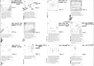
In order to make sure that we knew eactly what was required for each shot in our narrative we decided to create a storyboard so that it was all together. In this, we have displayed; camera shot, camera movement, sound, time and the edits to be used between each shot.

Monday, 21 September 2009

Film Poster Mock-ups
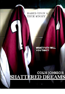
As part of the subsidiary task, Mikey and myself were required to create a film poster as a potential way to market our film. We used certain codes and conventions that we have recognised on existing products, used and developed them in order to make our product; catching to the eye, appealing to our audience and not give away too much information on what the narrative is about. We created 3 initially, so that we had the opportunity to get feedback from our class on which images worked the best with with fonts and colours. After we had obtained this information, we set about creating the best possible poster that attracts all audiences. We have chosen to use the poster on the left as a sort of 'teaser' poster, which has the effect of giving away absolute minimal detail with regards to the narrative of the film. The image gives very little away about the specific genre, it is however, possible for the audience to assume that it will be about sports- as the setting of the photo is clearly in a changing room, and the props used are sporting attire. This product would be released at a similar time to the teaser trailer, maybe even before- as it requires no characters from the narrative to be present. So in effect, this could be a cheap and easy way to market our product as soon as the script has been written and actors chosen, as this would make the film be known a long time before it's cinema release, creating a sense of enigma as the audience will be enticed to consume the final product as they had seen the very first advertisement a certain number of months previous. The poster on the right, however, would be produced and released to coincide with the release of the full-length trailer, as it contains a bit more detail in terms of what is contained in the image, but also there is a full cast list presented, a review and a indication of when the film is actually going to be released and the institution logo.

Sunday, 20 September 2009

Marketing Of Films

I researched some successful ways to market films as this is the starting point as to whether a film will become well known before it's release. In the preliminary stages of producing a film, the film company will undertake a large amount of audience research in order to find a potential gap in the market, or just discover what the consumer wants. Once the company has conducted this research, collated and combined the results, they can then start on the product. However, in order for a product to sell, it must be marketed well, so that everyone inside and outside their desired audience pool know about the upcoming production and will put money into it when it is released. If you a film is marketed well, this could be by; advertising the teaser and full-length trailers on television and before films are played at the cinema, create movie posters and have them strategically located where a a lot of people will see them (roadside bus stops, on the side of buses, busy shopping centres etc.), create a website which would be advertised on both the trailers and posters for the audience to visit to get a further in depth look at what the production will be about. This can all however, be influenced by the audience research conducted at the beginning, as it may turn out that only a small percentage watch television or go to the cinema to see films regularly so they may have to consider some other ways to market their production.

In order for my production to be a success, I must too use what I discovered in my audience research discover the best way to market films for my particular target audience.

The use of Facebook to market films Conventions - Display photos - User Information; Friends General Public - Administrators - Advertising Companies - Privacy settings~ user can control visible information - Free for users - Pay per advert - Instant messaging - Global community - Levi Strauss- binary opposites - Isolating activity but part of a global community (social) - Elements of blogging - Games - Can personalise homepage (MySpace) - Add music - Interaction via music The MySpace and Cloverfield Epidemic Before the film and before even the trailers had been created and released to the public the production company, Paramount Pictures, set up individual MySpace pages for the characters of the film. After making their profiles public and adding thousands of people all of whom believed that these people were real, they started making posts about some of the events that could have happened leading up to the beginning of the film. The effect of doing that, was so that the public and their followers on MySpace believe that they are real. This had the snowball effect of; when the public watch the film, and see their 'friends' from MySpace in it, with similar events happening in the film to the posts on MySpace, they would believe that these events were really happening- along with the use of a handheld camera used throughout the whole film created a huge sense of realism for the audience. Strengths of marketing this way; -It's cheap for the production company; No cost to establish/set it up No cost for employing a specialist to do it, as it's also fairly easy to use - As it's on the Internet, it's easily accessible for both the audience and the user/creator (for changes etc) Weaknesses of marketing this way; - Easy to lose all information - Can be time consuming if a lot of editing is required

Friday, 18 September 2009

Websites Analysis
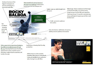
In this new age of technological development websites are a very important way to market a film, it's subsequent DVD release and possibly even some merchandise (such as branded clothing, Cd's, memorabilia etc)- if the film is iconic enough.
I chose to analyse the website for the 2006 film Rocky Balboa, because it too, falls into the genre of sports drama, so in order to make my website attract and appeal to a similar audience, I can use, develop and challenge many of the features I found. I chose to analyse this website, because of how popular and amazing the whole Rocky saga has been over the last three decades. So in order for my product and it's ways of marketing to be anywhere near as successful, I believe that this would be a good choice of role model for me to use, develop and challenge the conventions from.
To make bigger; please click on image

Thursday, 17 September 2009

Analysis of Film Posters
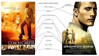
After researching into what features the majority of film posters contain, I came to the conclusion that for a film poster to be a successful one- in terms of attracting it's audience to it and creataing the perfect balance of enigma, that it must contain most of these features; main image, tagline, logo of institution, cast list, producer credits, certification, title, release date, review, star rating, website address (to obtain further informtaion about the film- also another way to market it).
The two film posters I had an in depth analysis of, and annotated contained 8 of these 11 features. They failed to display a certification, review and star ratings. This is most likely, simply because they chose not to, as there is no specific rule to what must be displayed on a film poster. By leaving out the certification however, some audience members who see this and think it looks to be a good film may be disappointed if they are not let in to see it at the cinema.

Wednesday, 16 September 2009

Codes And Conventions Of A Sports Drama
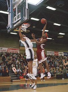
I decided that in order to make my product similar enough to existing products of the same genre, I would undertake some research into what codes and conventions some trailers contain. Once I had obtained this information I could then use, develop and challenge them, in order for my piece to attract my desired audience, and complete the ultimate purpose of creating this successfully. Settings; sports stadium, training pitches- to show the difficult struggle the protagonist will have to overcome in order for them to reach their dream, prison, rougher areas (inside school or council estate) Camera work; exterior establishing shot sets the scene- zoom out from pitch (used in one scene in 'Gridiron Gang' when the scene moves from the harsh conditions of inside the prison, to the harsh conditions of the football pitch) , close-up/extreme close-up reveals characters' emotions- happiness, sadness, euphoria, guilt (creates empathy), high angled shot- looking down on character shows their vulnerability, low angled shot- looking up at character which their shows authority, tracking shot- shows tracking characters dominance within the shot, could be tracking a moment of play within their sport showing their amazing ability. Props; sports equipment- balls, whistles, chairs (all make regular appearances in all sports themed films- some examples; Mean Machine, Gridiron Gang- one exception; Rocky) Sound; cheering fans, heavy beats of drums, dialogue, non-diegetic sound (theme song or other music) (in Rocky, the setting is slightly different, however the noise of the crowd- including cheering and drumming, is heard a lot throughout the main feature) Narrative and structure; losing team full of conflict between players, suddenly become good (the idea of this narrative structure came form Coach Carter- the team is rubbish and although there is no conflict between players, they dislike their new coach at first, however he makes them a better team as a whole- on the court and in the classroom); sports team used to reform prisoners and deter them from committing further crimes when they are released (this one comes from Gridiron Gang, in which a convict is offered the chance to play American football when inside- when he is released he goes on to play semi-pro football) ; normal person uses sport as a method of escapism from harsh times. Representation; protagonist could first be shown as a great achiever, performing well- but throughout the film is subjected to several incidents of bad luck, but regains his greatness by the end. Coach can be presented as the antagonist if he constantly pushes the protagonist to better himself, but eventually we realise that he is doing it for good reasons (this is used in Coach Carter, as he wants the boys to achieve well academically as well, so makes up some harsh rules to make sure they end up in college and not prison). Another antagonist could be a fellow teammate or player from the protagonists' rival team- whom he learns to respect by the end. In this still, from the 2005 film Coach Carter, we can see the use of chairs and sports equipment in use as props. The low angled shot and the positioning of his outstretched arm over his rivals, shows that he has the dominance in this shot. The use of sports team attire is also in use.
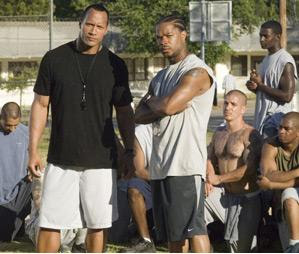
This shot is from the 2006 film Gridiron Gang. Through the camera shot placed a eye level of the convicts in the background, we are able to establish that because they're eye line is higher in the shot, that the to coaches have dominance in this shot. The use of some sports attire for the coaches and none for the convicts reinforces this point. The fact that the actually players cannot be definitely established though their unison in clothing suggests that the popular setting of inside a prison is being used here.

Tuesday, 15 September 2009

Hancock Film Trailer Analysis

Audience The film has quite a wide audience pool. Children will like it because of the narrative of a superhero, and as the age certification is 12A, children just above this age will enjoy it most. And because the protagonist is Will Smith, this will mean a lot of girls and women will be attracted to viewing the film. However, it is apparent from the trailer that there is going to be a comedy aspect to the film which opens the audience up wider, to really anyone that enjoys this type of genre. Narrative A superhero, but doesn't act like a real superhero (he wreaks havoc and causes a lot of destruction when attempting to catch criminals), gets helped out to try and fix his image so that the people will love him instead of loath him. Media Language Non-deiegetic sound, of R'n'B music- which match the protagonists' persona as he seems like a fast paced guy that acts upon instinct. Could also be because of the roots of the protagonist- this type of music was introduced by the African Americans. Tracking shot- shows that Hancock is the protagonist. Close-up- reveals the protagonists' emotions through his facial expressions; he is angry that the child has woken him up- which shows he's lazy. The close-up also reveals his unshaven face, again, suggesting he's lazy. Jump shots match the genre as action/thrillers make your heart beat faster. Ideology Even living as a superhero isn't easy. Institution Columbia Pictures; Statue of Liberty, holding the light shows that it is leading the way for all other institutions- which reflects the narrative, in that Hancock will lead the way in the new era of superheroes. The bold font, graphologically presented in block form shows that Hancock is a strong and robust fighting force. Representation Hancock is represented as a bit of a bum when it comes to life, as he sleeps rough, drinks excessively and doesn't treat his body properly. Genre Action/thriller- police cars, superhero, fighting.

Gridiron Gang Film Trailer Analysis

Gridiron Gang is a film about the offenders in a penitentiary in America. This is a common setting for sports dramas to be located, like the British film; Mean Machine, or the American hit The Longest Yard. In this type of storyline, the offenders are often perceived as the criminals of society, hence why they're locked up, this can be through the camera angles- high angles looking down on them. However, in this film they are offered a chance to change their ways and sport (American Football in this narrative) often acts as a potential deterrent for the future. The trailer sets the scene with a blacked out screen, this creates an enigma for the audience as this colour connotes a sense of mystery, evil and a general dark time in someones life. However, this is broken by the institution of; Columbia Pictures. This shows us that it is an American made film, and could even hint that the one of the themes is going to be the sport of American Football. The use of the light being held high and shining through the font shows that the it is shining the path for the narrative's characters to follow on their road to a crime free life. The use of non-diegetic sound, in the form of a voice over speaking about negative times in peoples lives, totally contradicts the image we see on screen of cheerleaders jumping around and celebrating. From the mise-en-scene, the colours worn by the cheerleaders-red- would show their love and passion for what they do, much like the love and passion that the inmates will learn to have for the sport that reforms them, and their subsequent lives, once they are released. They are also used to reinforce that a definite theme of the film will the sport of American Football. The group of people splashing around in the pool also serves as a contradiction to the non-diegetic voice over, as this group of people show that a key theme of the film will be comradeship, and the relationship with the boys that go out onto the field and play the sport you love, alongside you. The on screen image, then changes to match the thoughts expressed in the dialogue. As the close-up of the prop- a gun, is used which shows that another key theme of the film will be potential violence. The location of inside the small supermarket, which is usually a peaceful place where people go in order to keep themselves and their families alive, through keeping them fed and clean etc, is broken by the scream of a female as, what we can assume to be a key character to the narrative, pulls a gun on her husband- showing that he is their to take a life in an institution that is there to sell objects that help maintain it. As the sound of a gunshot echoes, we see and hear the smashing of a glass window, suggesting that the character's actions has shattered someones life... In the next shot- a medium close-up of his face, it appears to be his life that he's broken. He is in a caged van and has his hands handcuffed together- showing that his movements are going to be restricted from now on. The caged windows, allow natural light to shine through suggests that at some point his better side will prevail over his violent side. The positioning of the convicts is central, possibly suggesting that they have the power and authority in the shot, however, they are standing with their backs to the camera and as a guard walks past them, this creates an over the shoulder shot, immediately giving him the power and authority, which is supported by his police uniform, giving him a higher status in society as the protector of the people. The short fighting scene again, reinforces the idea that violence is going to be a key theme throughout the narrative. And the use of designated uniforms for the inmates immediately lowers their status within the shot and an society, as due to this, there is no difference from one offender to the next- they all appear to be bad people. An over the shoulder shot reveals the character that had spoken in the voice over until this point. Although we come to realise that the person who's shoulder we are looking over is his boss, the person is focus still has the authority, he is the man with the plan, the one willing to risk everything for this out of control group of criminals. In this scene, the use of the prop- a desk, between the coach and his superior acts as a barrier, as the coach is willing to do something to help the convicts, whereas his boss is more than happy to just keep them there, unreformed as they await their trials in court. The long establishing shot of the prison yard establishes the scene for the reforming players. From this scene we are able to see the harsh conditions they will be forced to play in. The shot of the coach, with his back to the camera speaking to the young offenders, appears to show them with the authority, however, he is positioned centrally and standing whereas the prisoners are kneeling, looking up at their new coach. The close-up of one member of the new teams' arm shows a gang tattoo, revealing another theme of gang warfare, and as two opposing gang members enter into a brawl, we are able to see that the coach is possibly trying to do the impossible. This is a stereotypical thing to happen in sports dramas, one person almost breaking and giving up, however it is what they do next- striving harder to be better, that really shapes the film and make it inspirational to it's audience. The use of a new uniform (a kit for their newly formed team) helps to raise the inmates' status, as they are now together as one and are different from other convicts as they have made an attempt for a better life. The use of the tracking shots of certain players/convicts on and off the ball shows their authority as the stars of the Mustangs team, and also reveals their passion and love for the game as they become central figures. The next shot shows various pieces of sporting equipment, more specifically those related to American Football, this again, reinforces the idea that sport is going to be a key theme in the narrative. The last few shots are put together well, with lots of jump cuts, showing some of the actual sporting clips from the film. They start with the Mustangs clearly being dominated, but seem to end with them coming up evens, ending on an enigma of whether the team will do well and if the players will conquer their inner demons and enter their lives outside of prison without all the hatred and violence from before.

Monday, 14 September 2009

The BBFC

Who are they? The British Board of Film Classification is an independent, non-governmental body, which has classified cinema films since it was set up in 1912, and videos since the passing of the Video Recordings Act in 1984- source; www.bbfc.co.uk/about Their main purpose is to classify any type of moving media into advisory, age-related categories. How is this classification going to affect my trailer? Once my potential target audience has been established, I must then make sure that all contents of my trailer, and the subsequent film, fall into the correct age certification. It is essential that I classify my film into the correct age category and display this on both my main task and the subsidiary task of the film poster, as if this is is not done strictly, the consequences can be either a fine, prosecution or the closing down of production completely.

The classification brief, for 12A; Drugs; any misuse of drugs must be misfrequent and not glamorised or give instructional detail Violence; moderate violence is allowed by should not dwell on detail. There should be no emphasis on injuries or blood, but gory moments may be permitted if justified by the context. Sexual violence may only be implied or briefly and discreetly indicated, and must have a strong contextual justification.Source; www.bbfc.co.uk/downloads/pub/Guidelines/BBFC%20Classification%20Guidelines%202009.pdf

Because, in these two sub-sections it could be possible to argue that my trailer breached some of the terms, I have decided to give my trailer an age certificate of 15.

Institutions

Institutions are a key factor to the film, and possibly potential audience. They are shown on every trailer, both the full length and teaser versions, and are featured at the beginning of the films when they are released. Once an institution has built up enough of a good rep for itself, it is possible to assume that some people will notice that a film has been published though this institution and immediately realise that, because of its previous track record, that films released with this institution are likely to be good ones. On first glance at an institutions logo, most people just see it as a logo- but in depth exploration of the graphology used shows that it is so much more.
Columbia Pictures
American institution- the Statue of Liberty is the main image, which would have an advantage of global recognition. The fact that it shows the statue as holding a light, which is shining brightly suggests that it is leading the way, as institutions go. The image is located in the clouds, suggesting that it is above all other institutions. The graphology of the font shows it in blocks, suggesting that its tough and robust- therefore it is there to stay at the top. The colour of the font is gold, which connotes a sense of prestige and wealth.
Paramount
Again, the clouds suggest that it is above all other institutions. The use of the mountain as the main image suggests that it is almighty and hard to overcome and beat. The lexical choice of 'Paramount' connotes a massive mountain, which reinforces the previous point. The text is quite soft and subtle in the writing style of a signature which suggests that it is quality and is more personal as the audience feel as if the creator has signed it especially for them. Whilst the font is quite soft, which could show weakness amongst the bold and brutish fonts of the other institutions, it is reinforced by the graphological feature of stars, showing quality (star rating for restaurants and hotels)
20th Century Fox
Big block font shows that it is strong, robust and resilient compared to all other institutions. The use of a low angled shot, looking up at the institution name shows it's dominance over other institutions. The use of spotlights suggest that it is at an important ceremony, with the logo as the main act. The colour gold, connotes a sense of wealth, but also as being the number one institution.
MGM The use of a lion as the main image shows that it is a predator, hunting the weak as it's at the top of the food chain. The face at the bottom has a mouth shaped like a love heart, revealing their love and passion for the industry. The circle around the lion suggests that they will keep on going and that their successes will continue coming. The gold film tape suggests that they make footage of perfect standard. Warner Bros. Again, being located in the clouds, it suggests that this institution is above all others. The colour gold connotes a sense of wealth and being in the number one position. The logo is shaped like a shield, showing that it will defend it's number one position against any other institutions that possess a threat towards them. The continuous line of gold around the rim of the shield suggests that it will continue releasing products of such quality for a long time to come. The triangle of dependency show how the institution, text and audience are all linked in a state where all are reliant on eachother. It shows that;

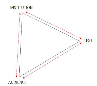
  • The institution must constantly adapt their texts in order to meet the demands of their audience, else the institution will get no profit from making any films.
  • The institution must initiate some sort of consumer research and find out what their audience want from a new film, or to try and find a gap in the market for a possible new genre or sub-genre. Then create the texts so that when it is released, it will sell well.
  • The audience needs the institution to produce new texts in order for there to be some sort of cinematic entertainment for people on a Saturday night- or for orange Wednesdays
  • The audience needs the texts to be entertaining to fulfil their requirements (e.g. escapism)
  • The texts need the institution in order to be produced and made into a film
  • The texts need the audience to view/put money into the product for the institution to get a net gain.

Sunday, 13 September 2009

Audience Research

There are two traditional ways to categorise audience research, they are; primary and secondary, and qualitative and quantitative. Primary research is when you receive it first hand, you are the immediate source that receives the answer, you are collecting data that does not otherwise exist. You can conduct this type of research through; questionnaires, interviews, focus groups, audience feedback (used after a mock-up or the final product is made), observation, surveys/polls. This type of research is great as you can ask a specific question and receive the answer directly, without any aspect intervention from anyone that could lead to the answer being influenced, and the question is worded exactly how you wish it, so the answer matches your questions directly. A disadvantage is that it can be hard or time consuming for you to conduct. Secondary research is when you get the answer from an already existing media source, meaning the question has already been asked and the information collated and published for all to use. This could be from books, the Internet, newspapers etc. This sort of research has its advantages because it is very likely that someone out there has asked the same question and published the answer. However, this sort of research could be biased or completely made up. Or that the audience asked may be very different to the ones that you desire. Qualitative research is is where the answer comes in the form of language. These are generally open questions which promote an opinion from the audience. All qualitative research will be unstructured- open questions, textual analysis, unstructured interviews. Qualitative researchers believe that their research should; be subjective, have an ongoing meaning and arrive at a hypothesis at the end of their research and sometimes create an issue of bias. Quantative research is where the answers can be displayed in the form of numbers- closed questions are used so that the person undertaking the research can determine the most frequent answer. All quantitative research will be structured- questionnaires and interviews using closed questions, structured textual analysis (tick box of features). Quantitative researchers believe that their research should be; objective, without bias and should match the hypothesis suggested at the beginning. Research can also be semi-structured, where certain aspects from each method of research are used, for example, both open and closed questions are used. This is known as triangulation- where the two points (Quantitative and Quantitative) rise and meet at the top, forming a triangle. My findings into; why do people watch sports dramas? I was required to undertake some primary to discover why people watch sport dramas- both films and trailers. This will help me to construct a trailer that will appeal to my audience. From my findings; - They make you feel good about yourself- through empathy, you may be able to relate to the protagonist or storyline in some way - For entertainment - For a sense of realism- in this genre, the films and narrative are a lot more realistic than that of any other genre - Escapism- it offers the chance to escape from our surrounding environment in life

Saturday, 12 September 2009

Narrative Structure And Development Of Teaser Trailers

Most full length trailers follow Todorov's Narrative theory (1969). He suggested that every narrative (and the subsequent trailer) contains 5 stages; Equilibrium- everything's fine and peaceful. Disruption- an event occurs that causes disruption, usually caused by an antagonist character. Recognition- the protagonist character recognises that there is something wrong. Attempt to repair- the protagonist attempts to repair/solve what has happened, this may include a battle between the protagonist and antagonist. Equilibrium- this is when peace and tranquility is restored, unless there is going to be a definite sequel, in which the film may end on a cliffhanger, where equilibrium is not restored. This final stage is the most used throughout full length and teaser trailers, because the function of a trailer, which ever type, is to entice the audience to watch the feature length narrative, as this is where the money is made. Teaser trailers, do not however, have to follow this style. Teaser trailers are only produced to reveal the most minute detail of the content of the narrative of films and of the characters and what their role will be within a film. Therefore it is not required to go into as much detail as revealing who the protagonist or antagonist is, or what they will do to either disrupt or restore equilibrium.

Friday, 11 September 2009

What Is A Teaser Trailer?

Teaser trailers are usually shown in cinemas up to a year before the release of the film- sometimes they are produced and released before the film production has even begun, meaning that it is not possible to show many images from the final production, but instead the producers use voice overs, simple images or even just blank screens to create a sense of enigma, leaving the audience totally unaware of anything that will happen in the narrative of the film so will leave them guessing at numerous aspects of the film- actors, plot, genre etc. They usually last anywhere between 50 and 90 seconds, and unlike the full length trailers, are not always shown in chronological order, and end in a cliffhanger- this again works with the idea of showing very little from the production, to entice the audience to not only watch the full length trailer when it's released but the whole film. In terms of editing, teaser trailers use a lot of jump cuts and only stay on any one camera shot for a few seconds- this is to keep the production within the time limit. On some occasions however, teasers use variation in editing, and will either use a black out or fade out- these are used, like in the final productions, to create a sense of enigma by keeping the audience guessing at why the chosen colour of black has been used, or why the screen fades to a total black. I must use, develop and challenge the codes and conventions that I have discovered here in order to make sure that my product has the right balance of similarities and differences compared to existing ones.

Thursday, 10 September 2009

A2 Media Course

I have chosen, for my main task, to create a teaser trailer for an upcoming film. In this task I will be required to use my knowledge that I have acquired over the last three years and apply them to my own product, making a trailer that will appeal to my audience- through the use of camera angles, camera shots, mise-en-scene and lighting. I have chosen this task because after reading the tasks at hand, I believed it would be a real challenge, yet give me the opportunity to use all of my media knowledge to create a production to the best of my ability. As our two subsidiary tasks, we have chosen to create a film poster and website. We chose to create a film poster, as we had the experience of creating a print based production from last year's task of a magazine front cover. I have chosen to work as part of a group in this ask, the only two members being Michael Clark and myself. We decided to work together because we feel that our abilities in most areas are very similar, however, where one person could be seen as weak, the other is strong, for example, I have a tendency to struggle with some new technology.